4Paws is a Greenwich based independent business,
borne out of love for man's best friend.
borne out of love for man's best friend.
With years of development to become one of the Greenwich's
most successful and trusted dog walking businesses, the company approached George in need of a logo revamp which represented this.
most successful and trusted dog walking businesses, the company approached George in need of a logo revamp which represented this.
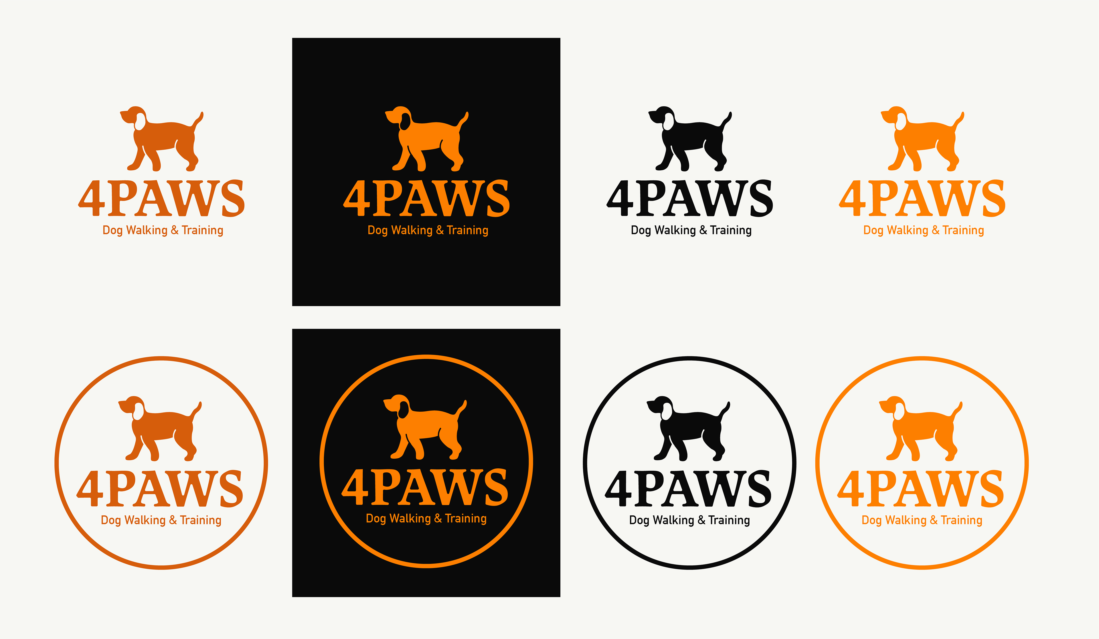
The new logo needed to reflects an image of professionalism and attention to detail, whilst keeping a likeness to their original logo.
What does a successful rebrand look like?
The process of rebranding should always start by asking questions.
As a creative, I need to be able to understand who the client and business are,
as well as what they are trying to say through this transformation. This includes:
As a creative, I need to be able to understand who the client and business are,
as well as what they are trying to say through this transformation. This includes:
1. Meeting with members of the business to better understand them as people.
2. Exploring competitors branding and what the rebranding needs to achieve.
3. Developing distinct branding to stand out from the crowd.
2. Exploring competitors branding and what the rebranding needs to achieve.
3. Developing distinct branding to stand out from the crowd.
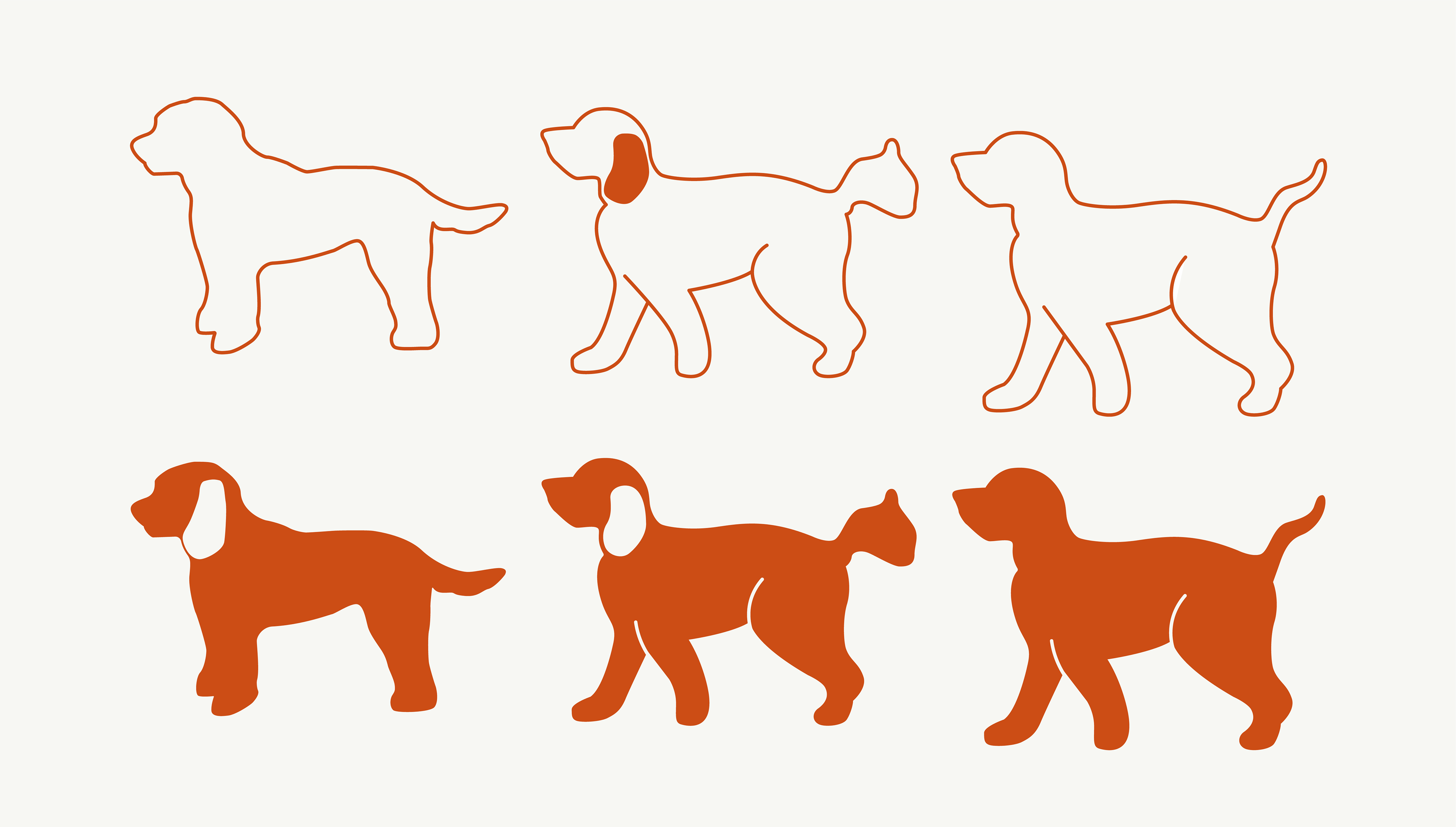
This data allows us to see into the heart of 4Paws. Collaborating closely with 4Paws owner Jayne,
allowed for important details to be included, like the silhouette of her own dog, Vixen. Conversations with Jayne also meant we were able to conclude that only a moderately change to the pre-existing colour palette would be best, allowing for the business to remain recognisable, yet bold and re-energised.
allowed for important details to be included, like the silhouette of her own dog, Vixen. Conversations with Jayne also meant we were able to conclude that only a moderately change to the pre-existing colour palette would be best, allowing for the business to remain recognisable, yet bold and re-energised.